Verint Connect Community Overhaul

As a vendor, the customers and partners of Verint need a central place to access their support cases, and product content and discussions on their Verint products.
The old community platform was due a new look & feel, but more importantly in need of a more outside-in, rather than an inside-out approach. This meant looking at all the product content through a new lens: what do customers want to see, what are they looking for and how can content be offered to them that fits their needs?
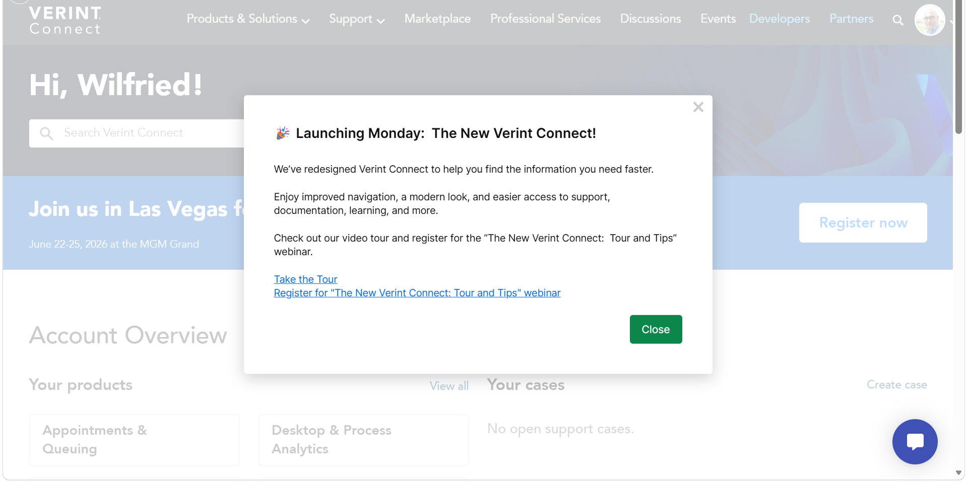
Listening to the feedback of their users, Verint has completely redesigned their Verint Connect community to improve the customer experience. Based on user insights, they have worked on improving the following:
- The navigation bar: it now has clear headers, which makes it faster to find exactly what you need
- Cloud service status and Verint academy: this can now be accessed from anywhere on the site from the utility bar above the main navigation.
- Home page: this has been redesigned into a personalised experience, giving quick access to content and products that are relevant for you.
- Product pages: the structure has been improved with an easy navigation bar.
- Support: the support page is always within reach, displaying your open cases, and the knowledge bases are organised so you can quickly find exactly what you're looking for.
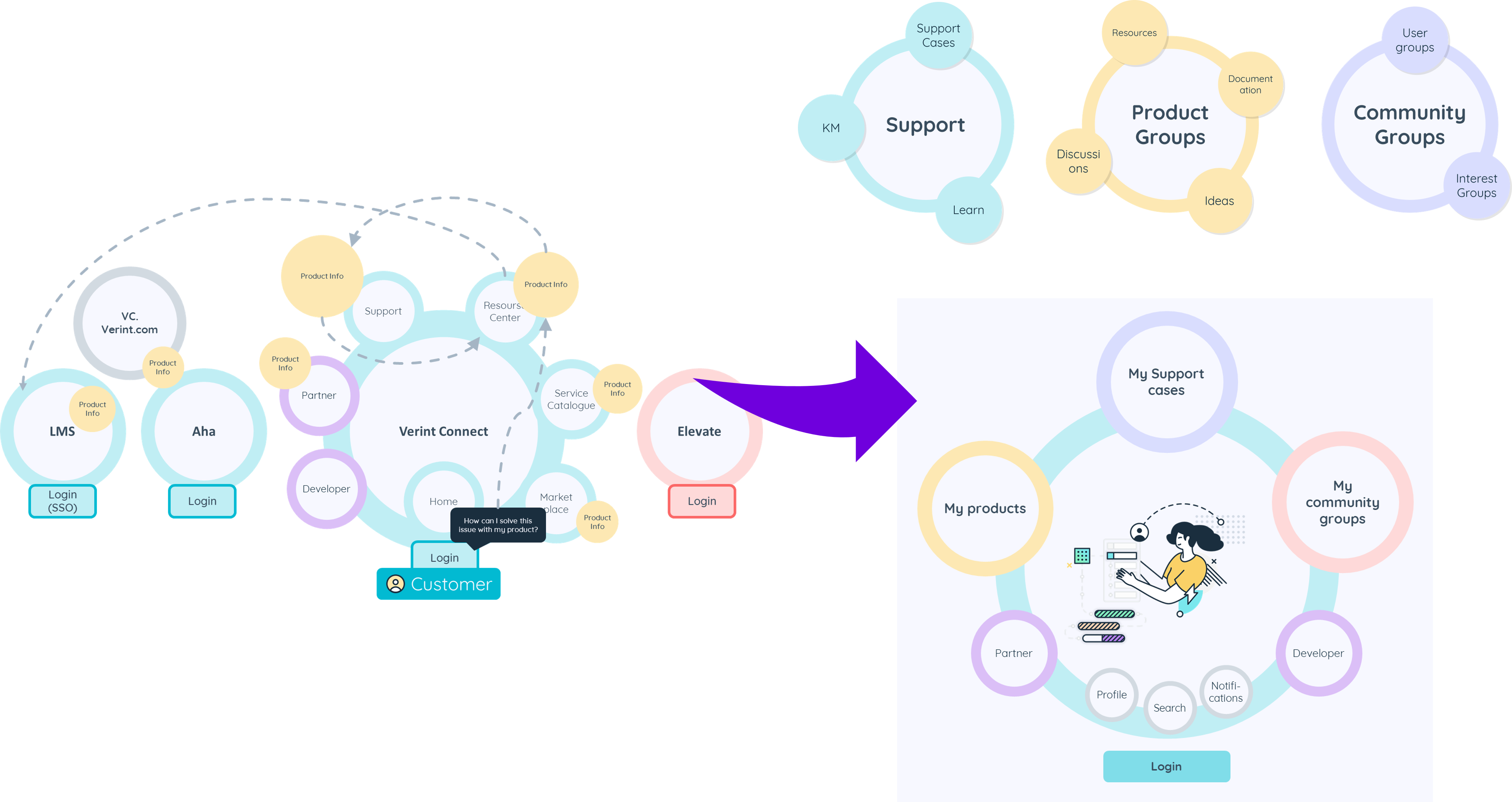
Community Overhaul from an Outside-in Perspective
Verint Connect has now been redesigned to give the right information at the right moment, helping their customers work faster. It has ben redesigned based on the 3sides best practices template, which helped in shifting from an inside‑out approach to an outside‑in perspective.
The new community is based on the following principle: Center around the customer and their products.
3sides made recommendations based on interviews and workshops with internal stakeholders and customers:
- Create a clear structure to reorder the information for better navigation and accessibility
- Personalize the experience
- Implement a modern and intuitive design
The community needed to deliver an improved user experience with a clear information architecture and an updated look & feel aligned with Verint's most up-to-date branding, ensuring a cohesive visual identity. This meant that all content would now be centered around the different Verint products, rather than around the services or tools in use by the Verint organisation.
Through a thourough data analysis and content remapping the community now shoes all relevant content for a customer in a single buiness product group.
Take a look for yourself
Curious what the new platform looks like?
If you are a Verint customer, check out the platform here.
Or take a look at the video tour here.